Here I will show you some graphics of the Contamination Project and explain them
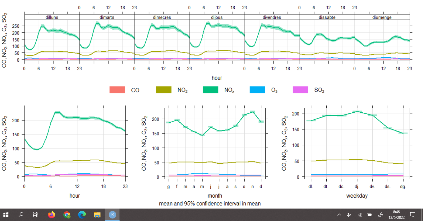
In this graphic you can see the pollution of each of the pollutants per day
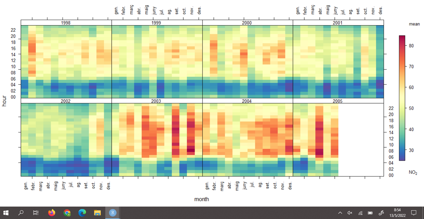
In this graph you can see the annual pollution of each of the pollutants
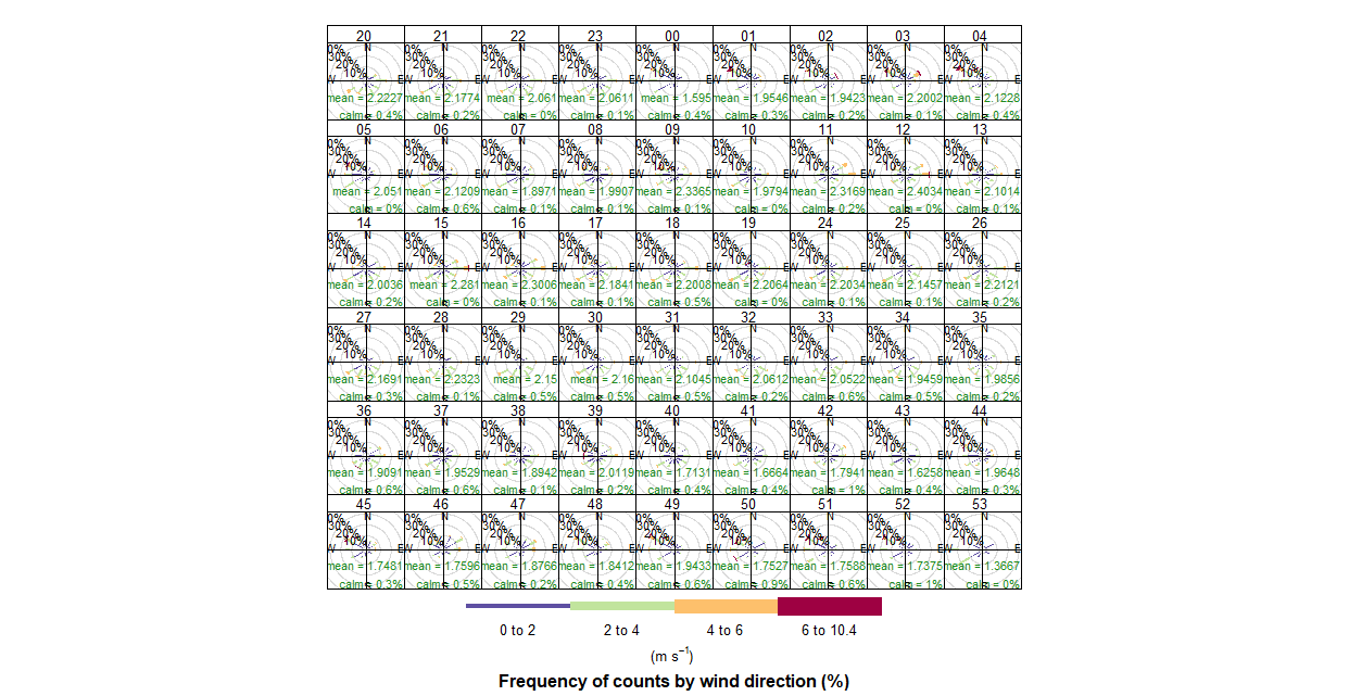
This graphic shows you the average wind speed of Barcelona (Sants),without specific components, during the 24 hours of the day, they show you in m/s.
All the results are in my Contamination poster, where I have explined what is the work and the finality about them, what I use in this project(materials,methods,libraries,etc), graphics, and the results, on it is possible to see the percentage at which each of the contaminants exceeds the limit